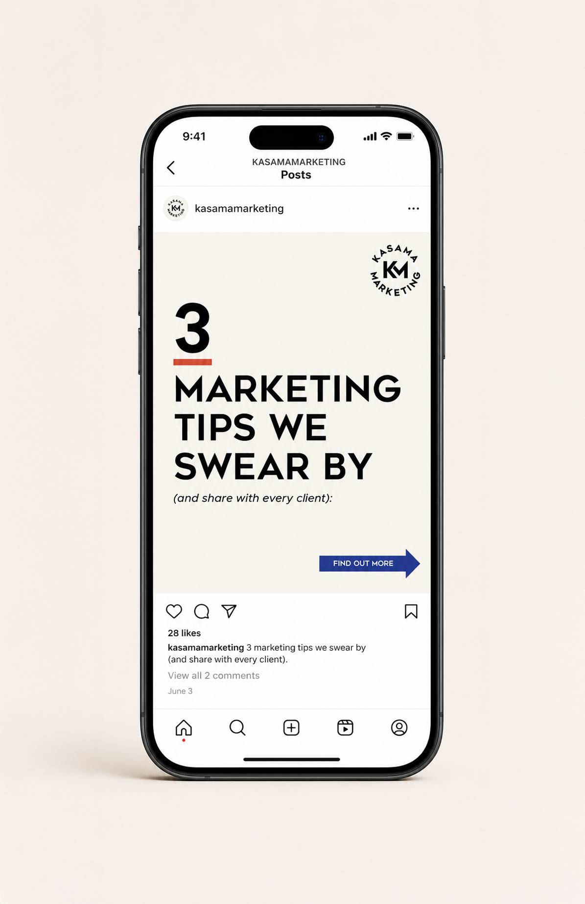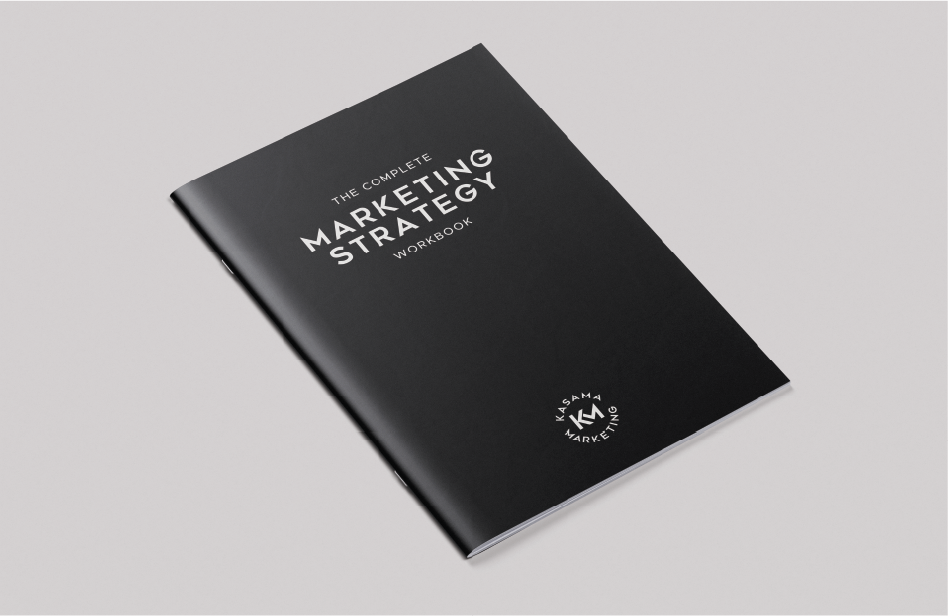
I worked with Kasama Marketing to update their brand so it better reflects how they actually work, clear, strategic, and easy to connect with.
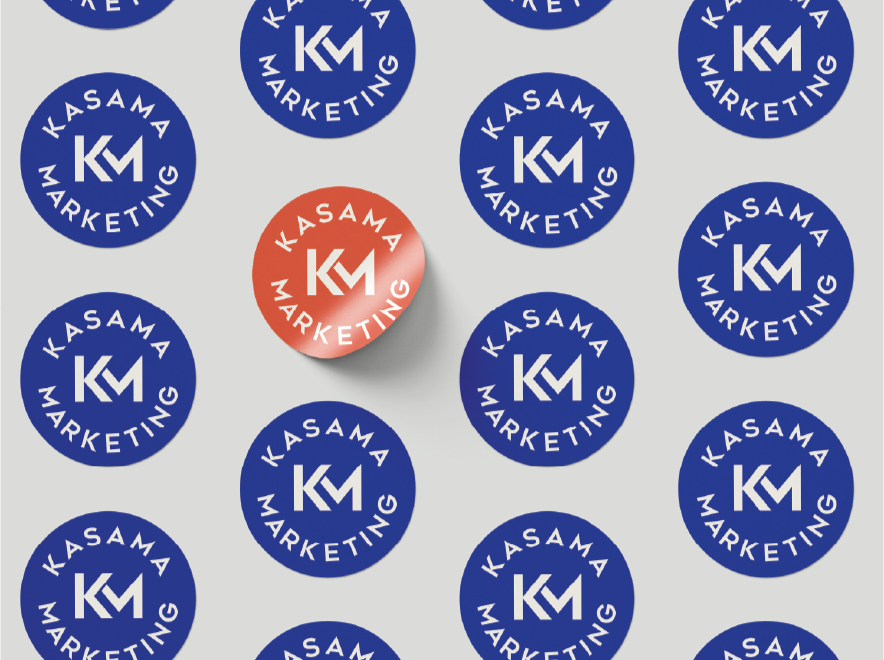
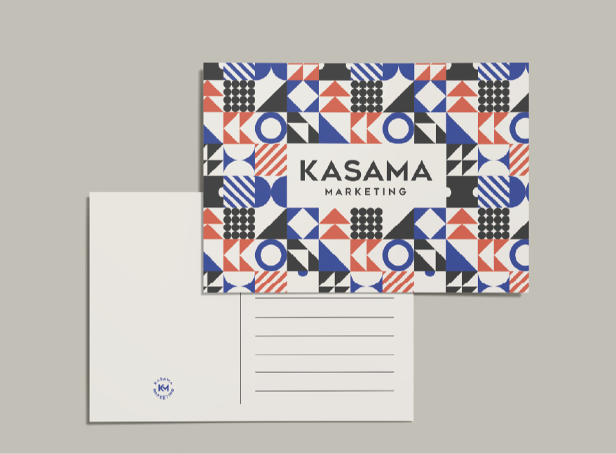
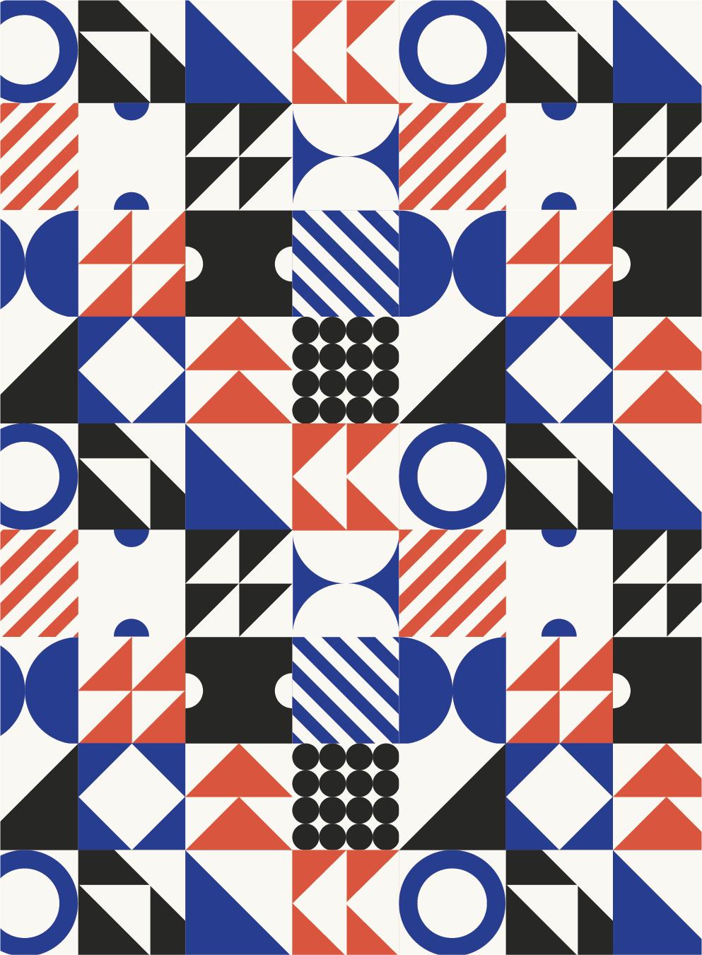
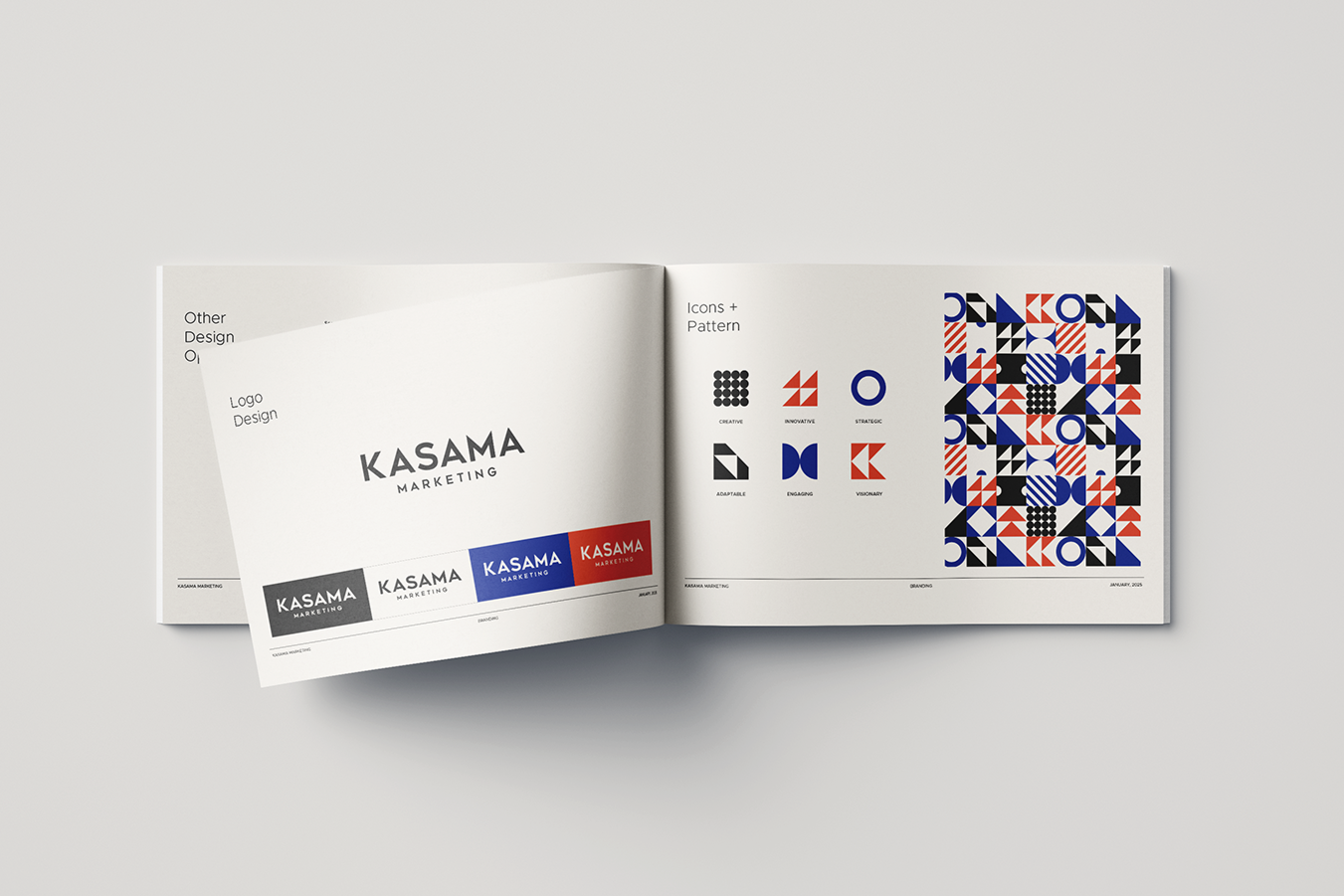
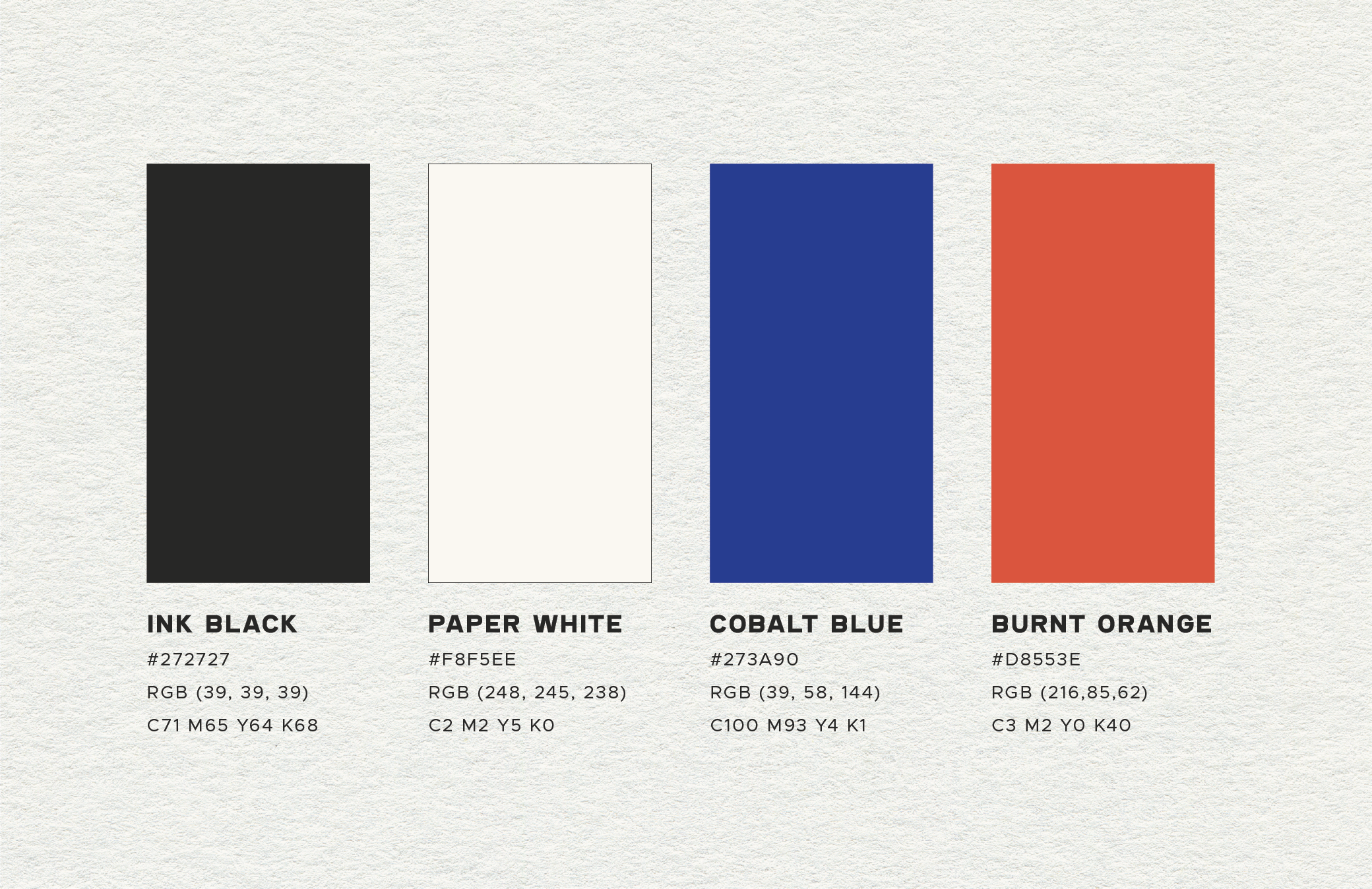
We started by simplifying things and building a more confident visual direction. From there, I developed a refreshed logo, colour palette, and typography, along with a set of custom icons and repeatable patterns to help bring consistency and personality across everything.
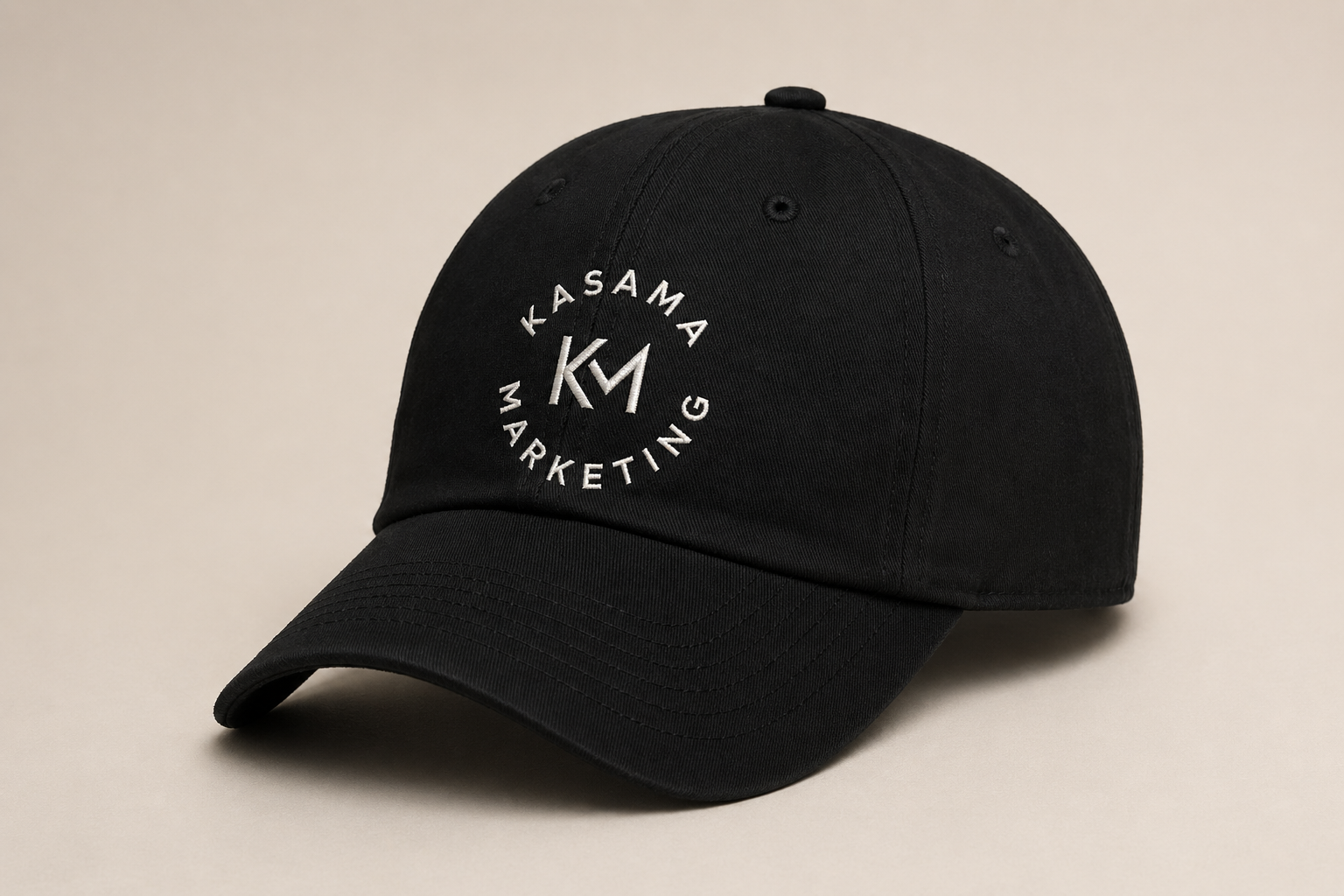
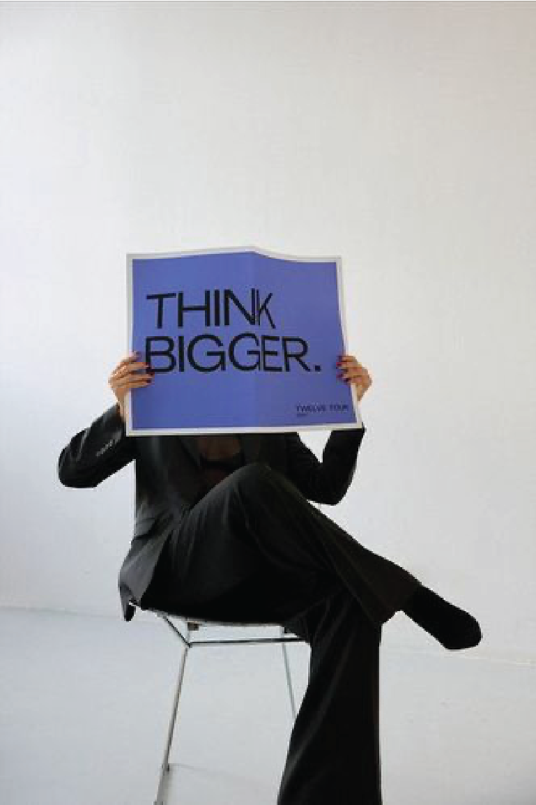
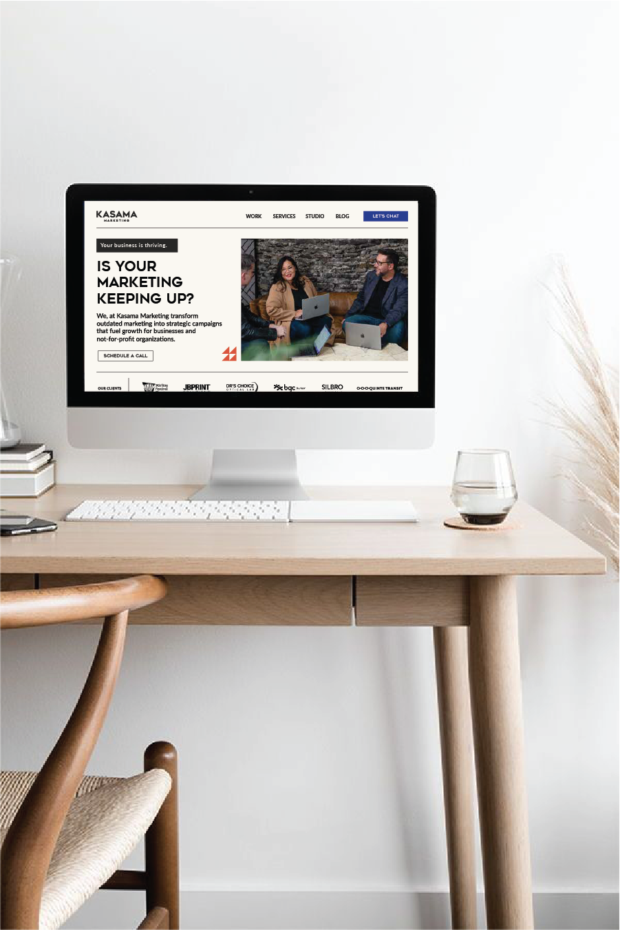
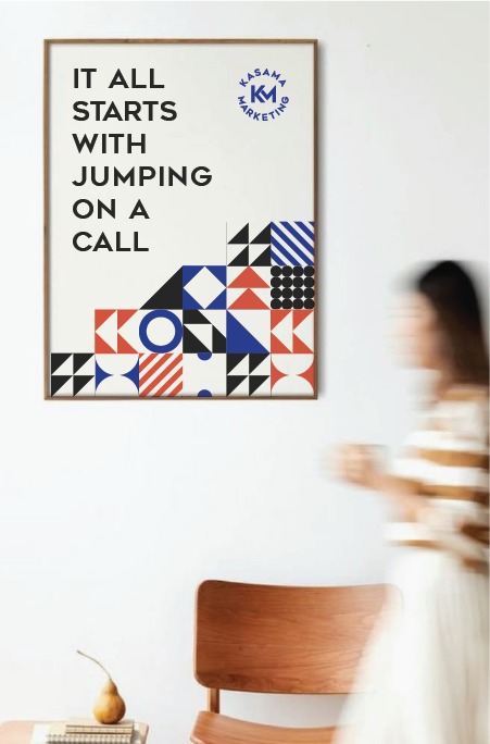
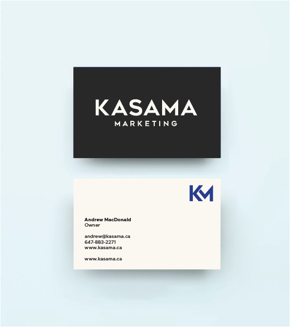
The system was then applied across social, digital, and print so it all feels cohesive and easy to use day to day.
The end result is a clean, modern brand that feels more like them and gives them a solid foundation going forward.
Creative Direction
Brand Identity
Visual System
Pattern Development
Typography & Colour
Graphic Design
Brand Applictions